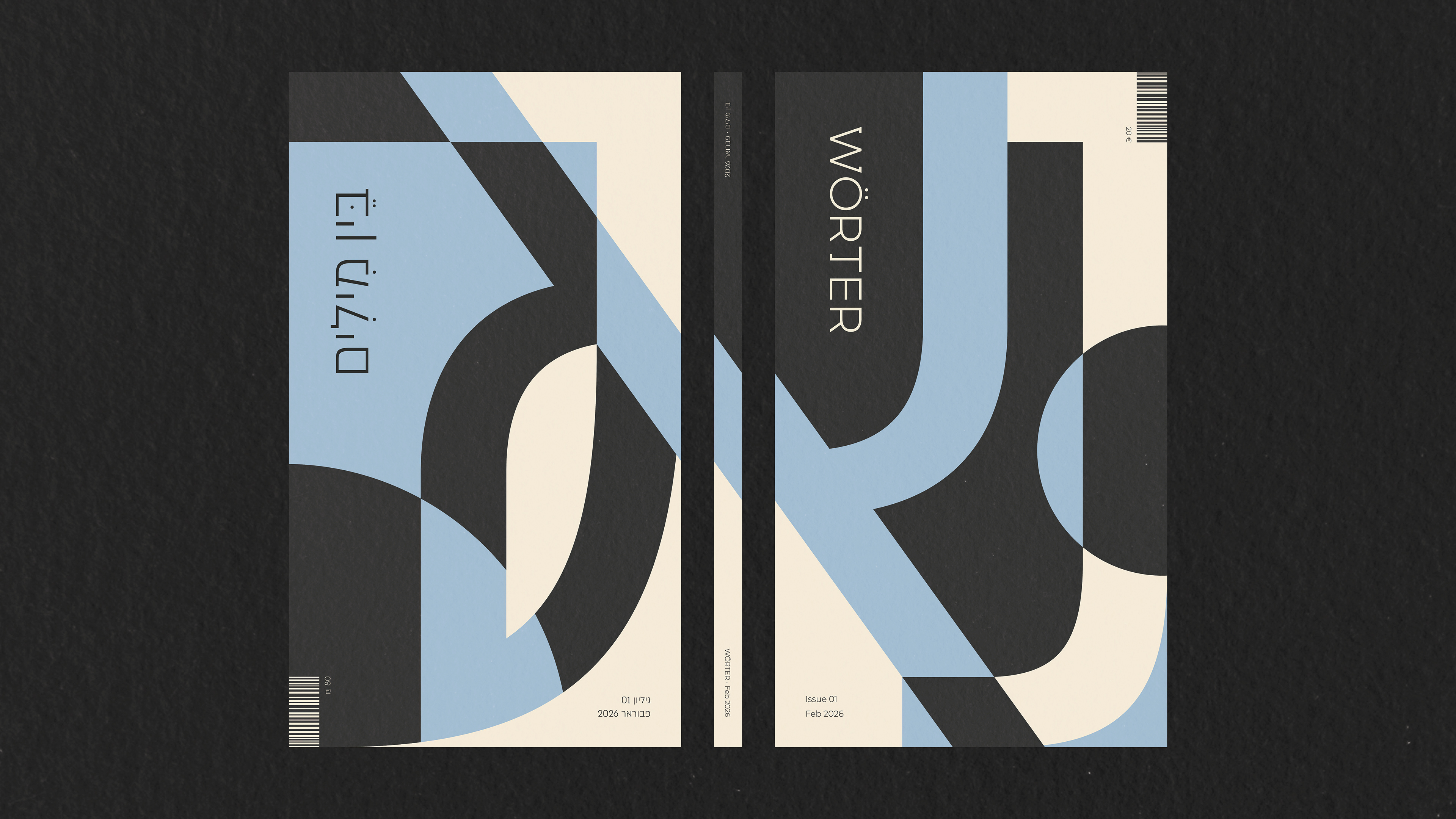
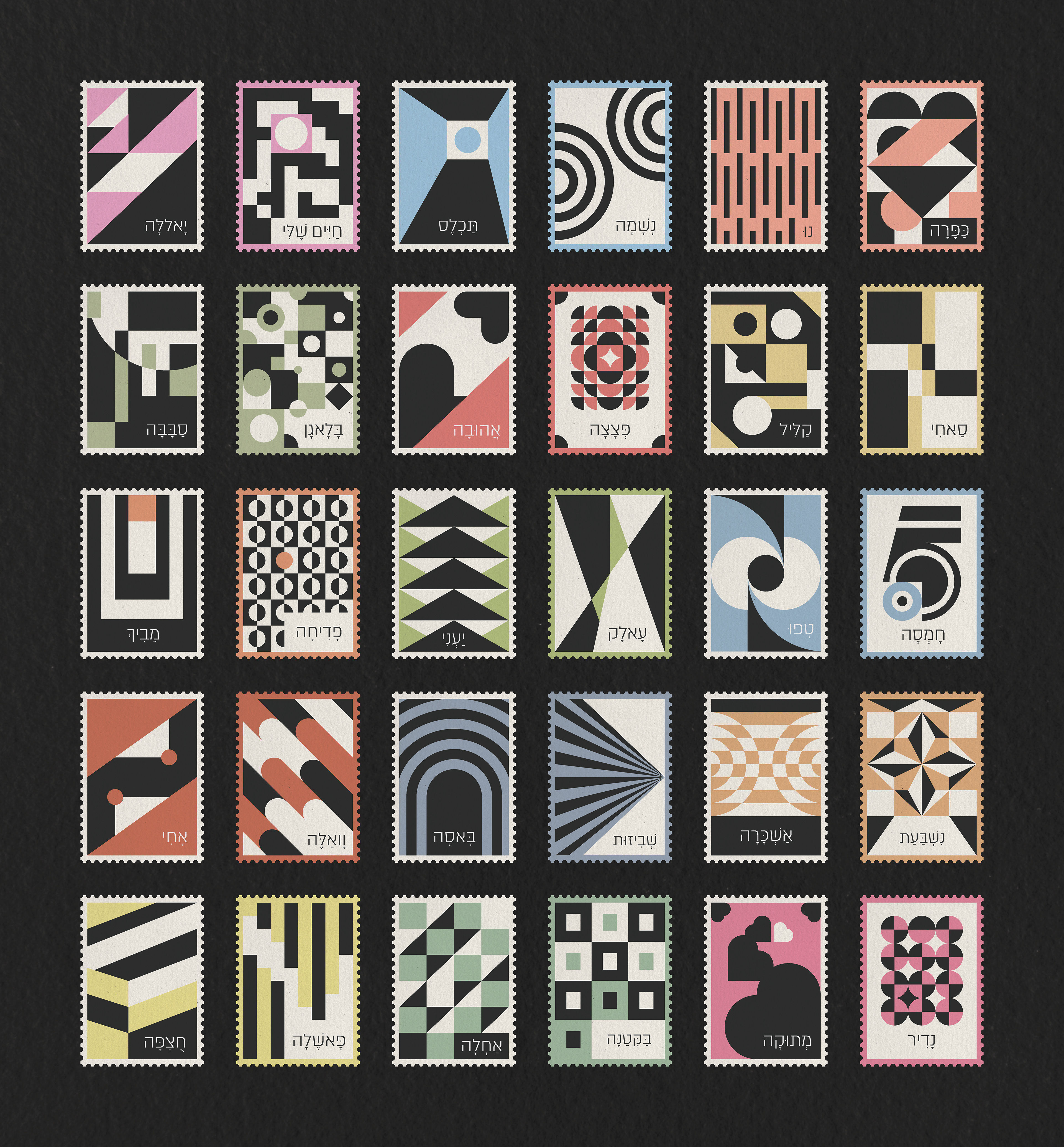
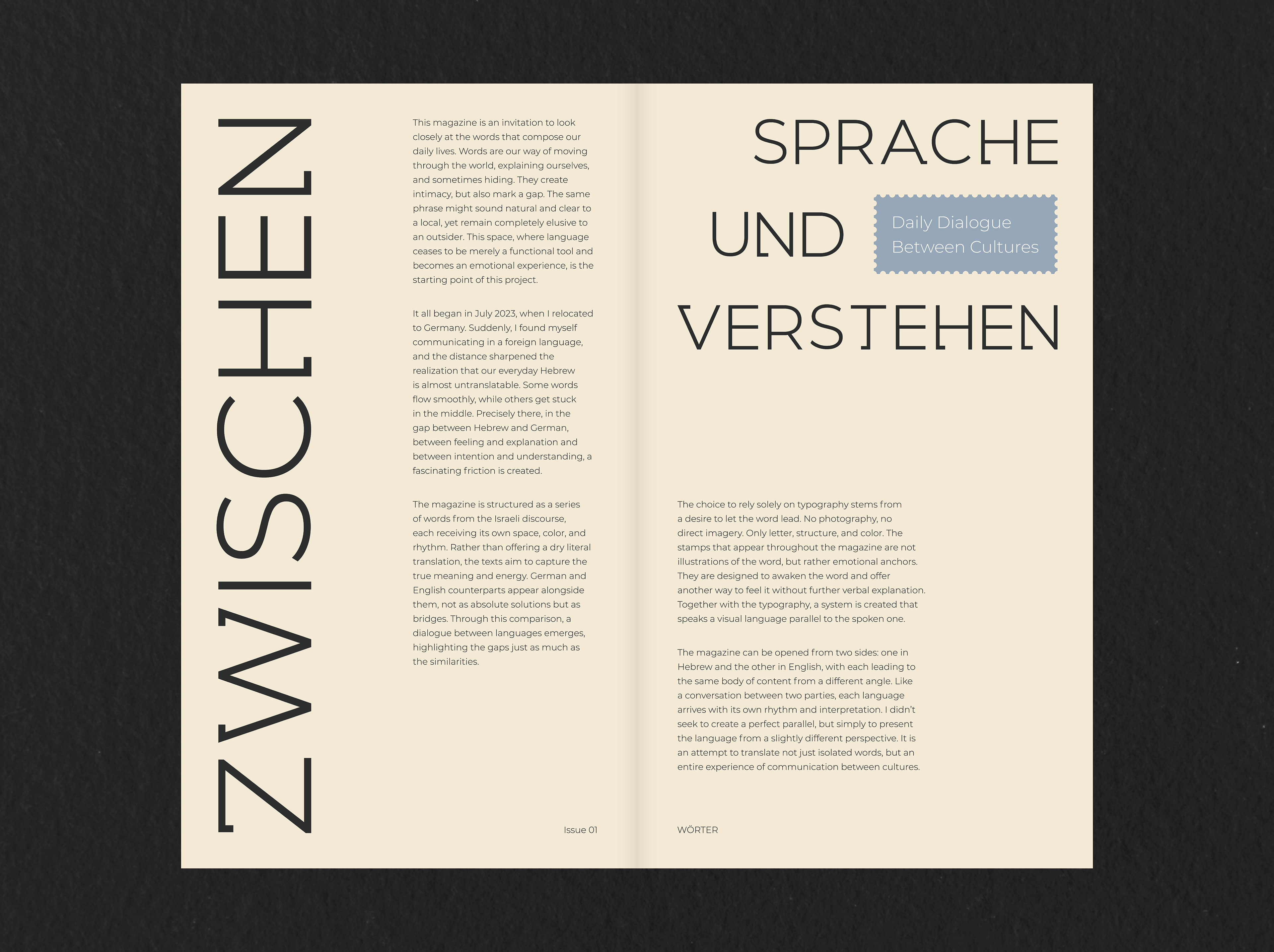
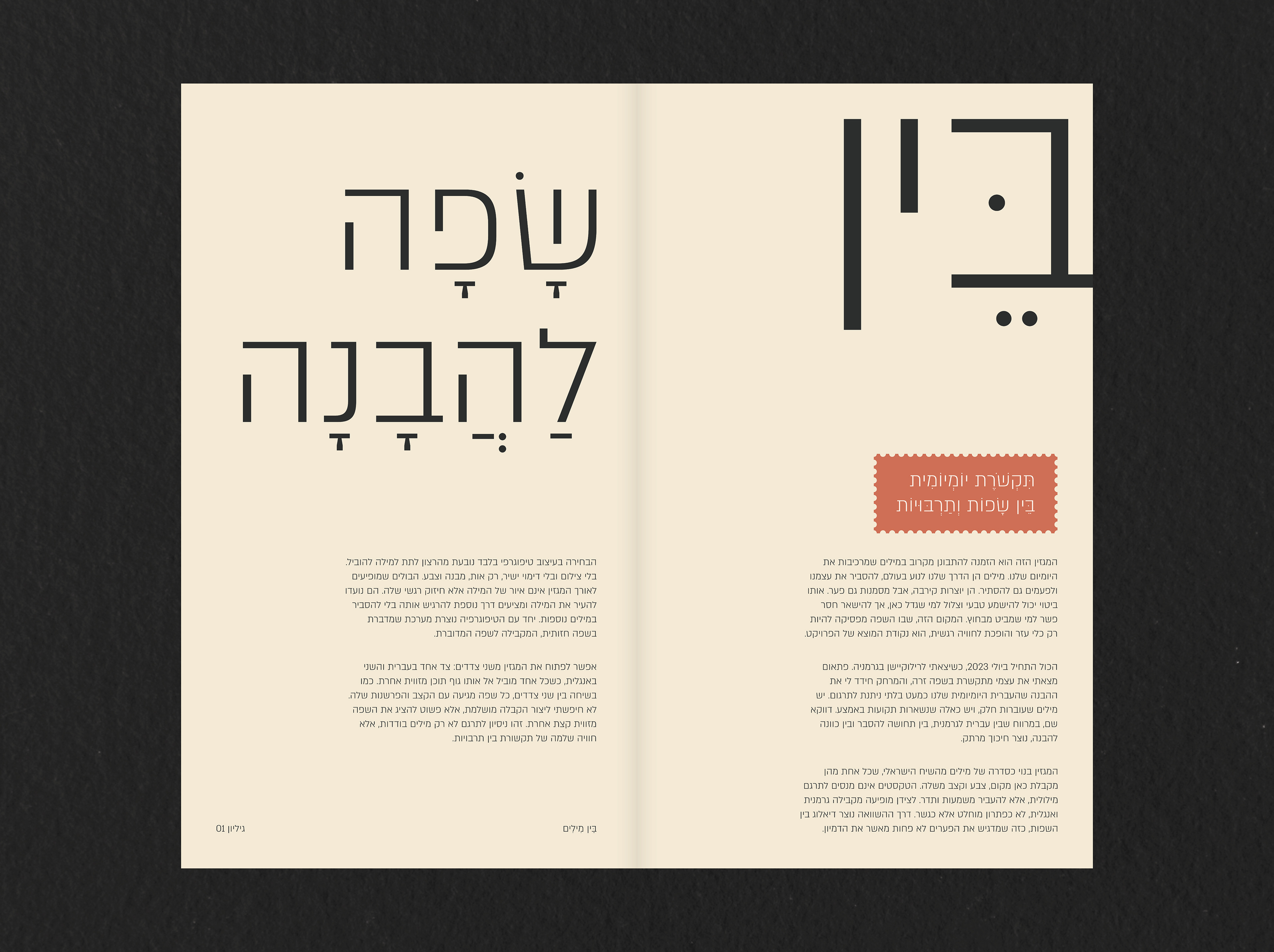
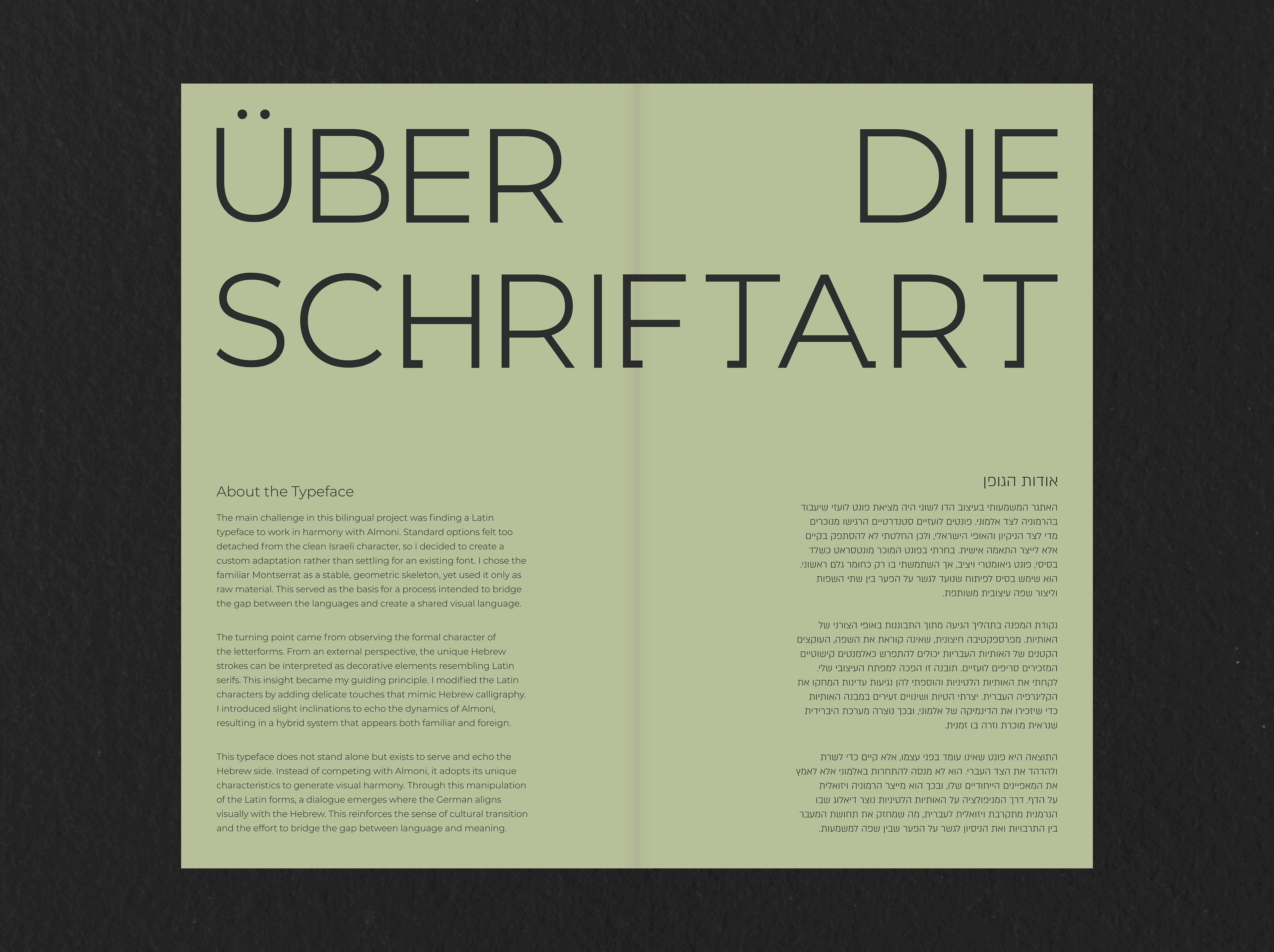
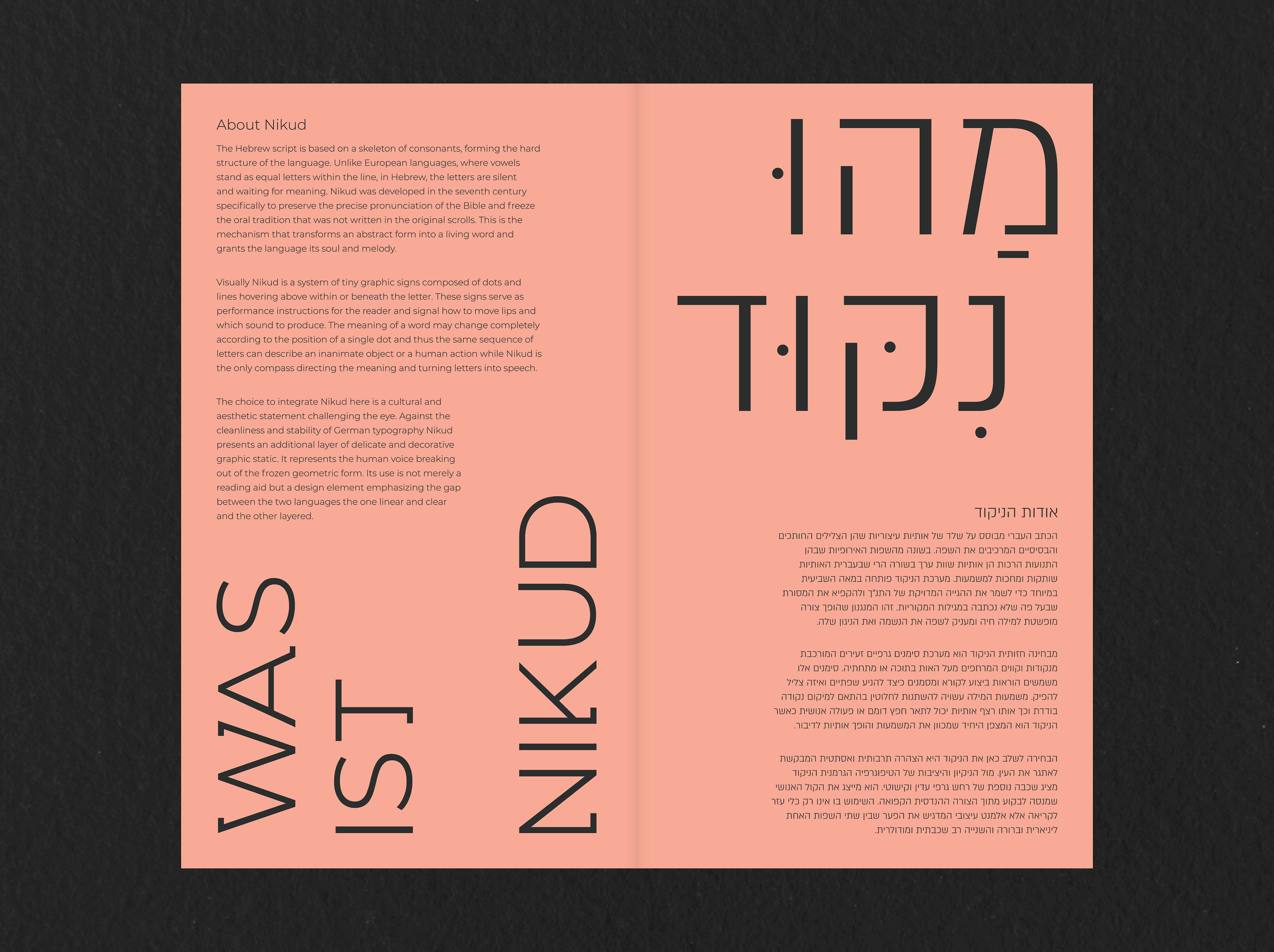
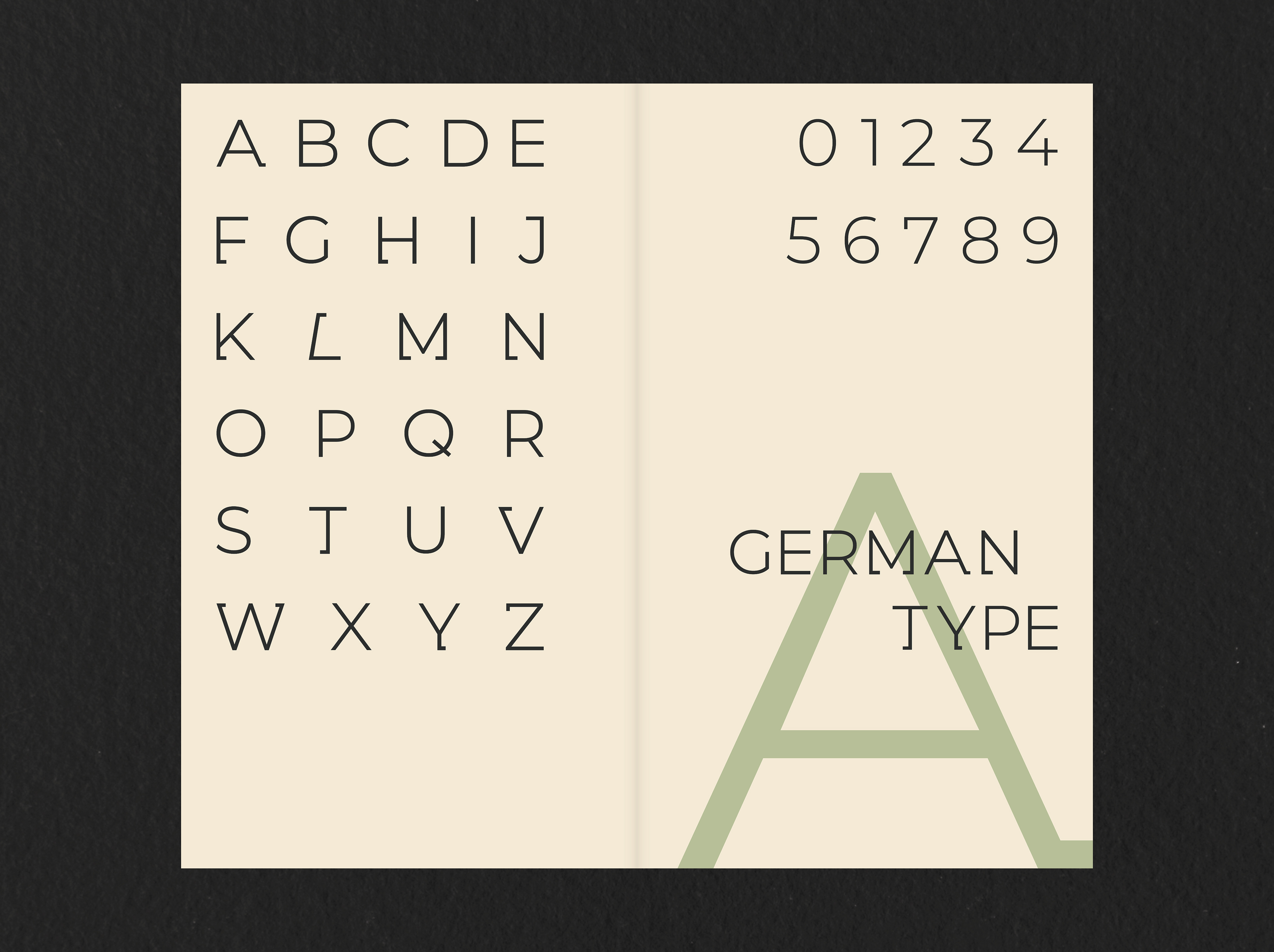
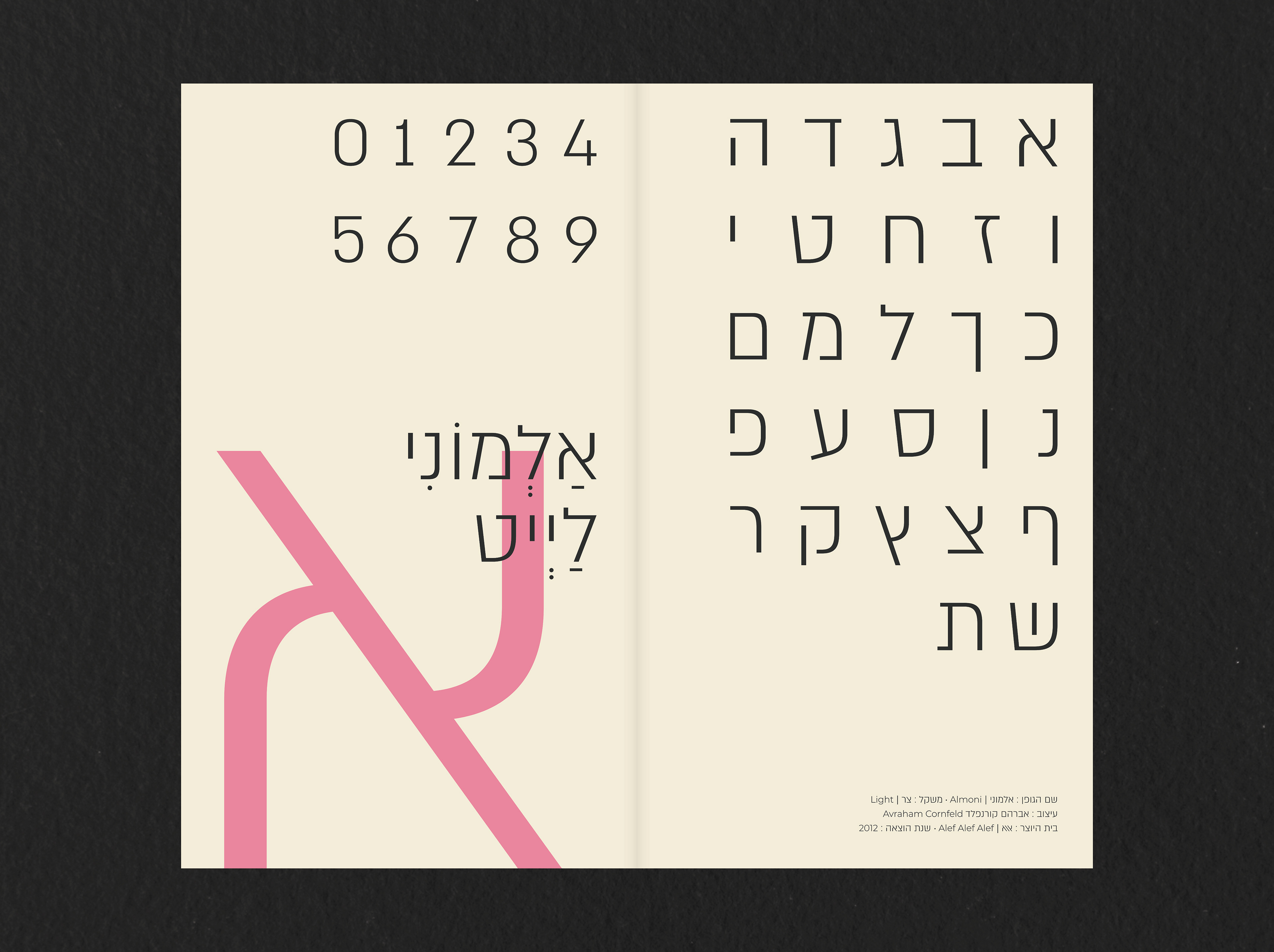
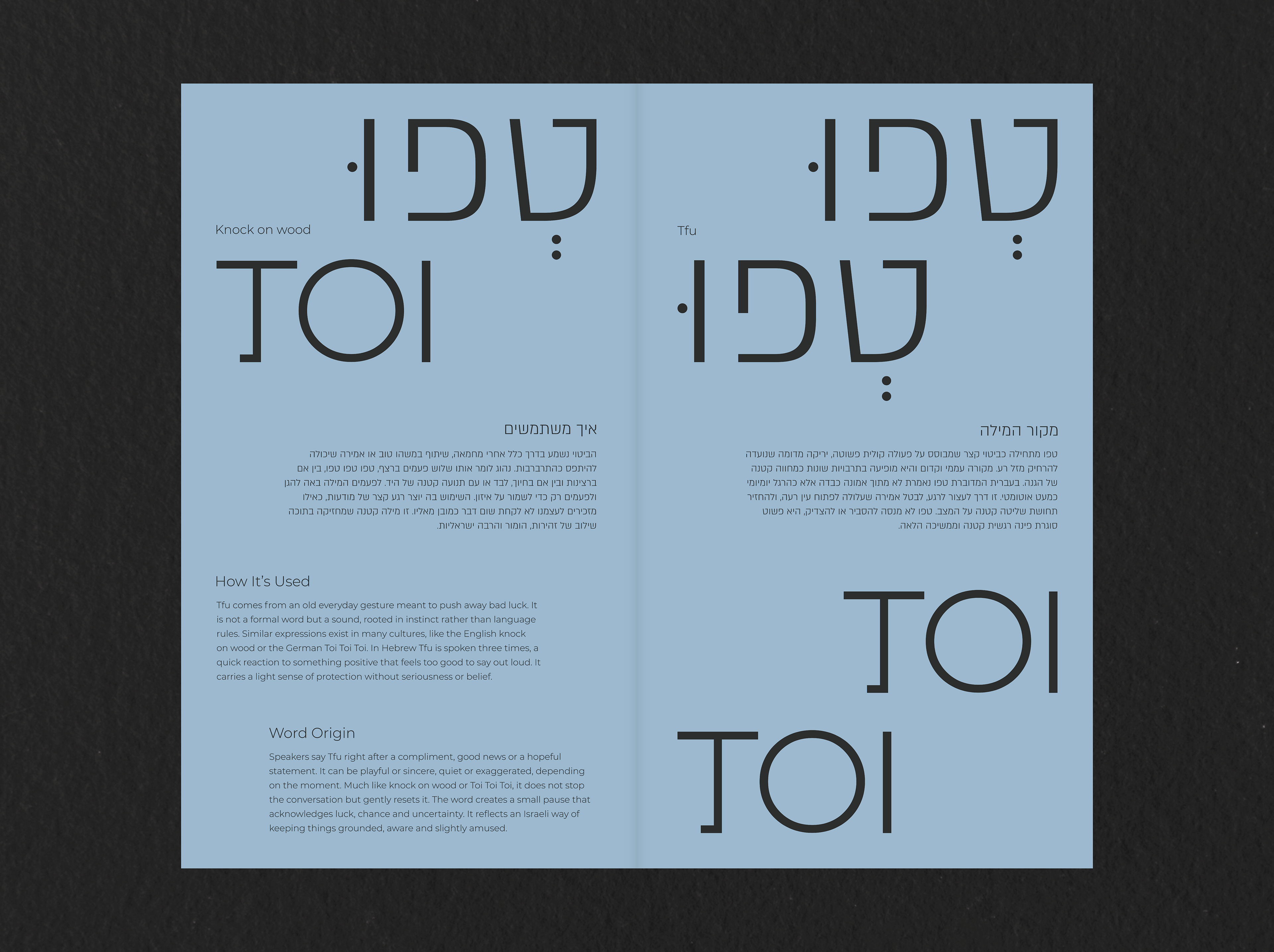
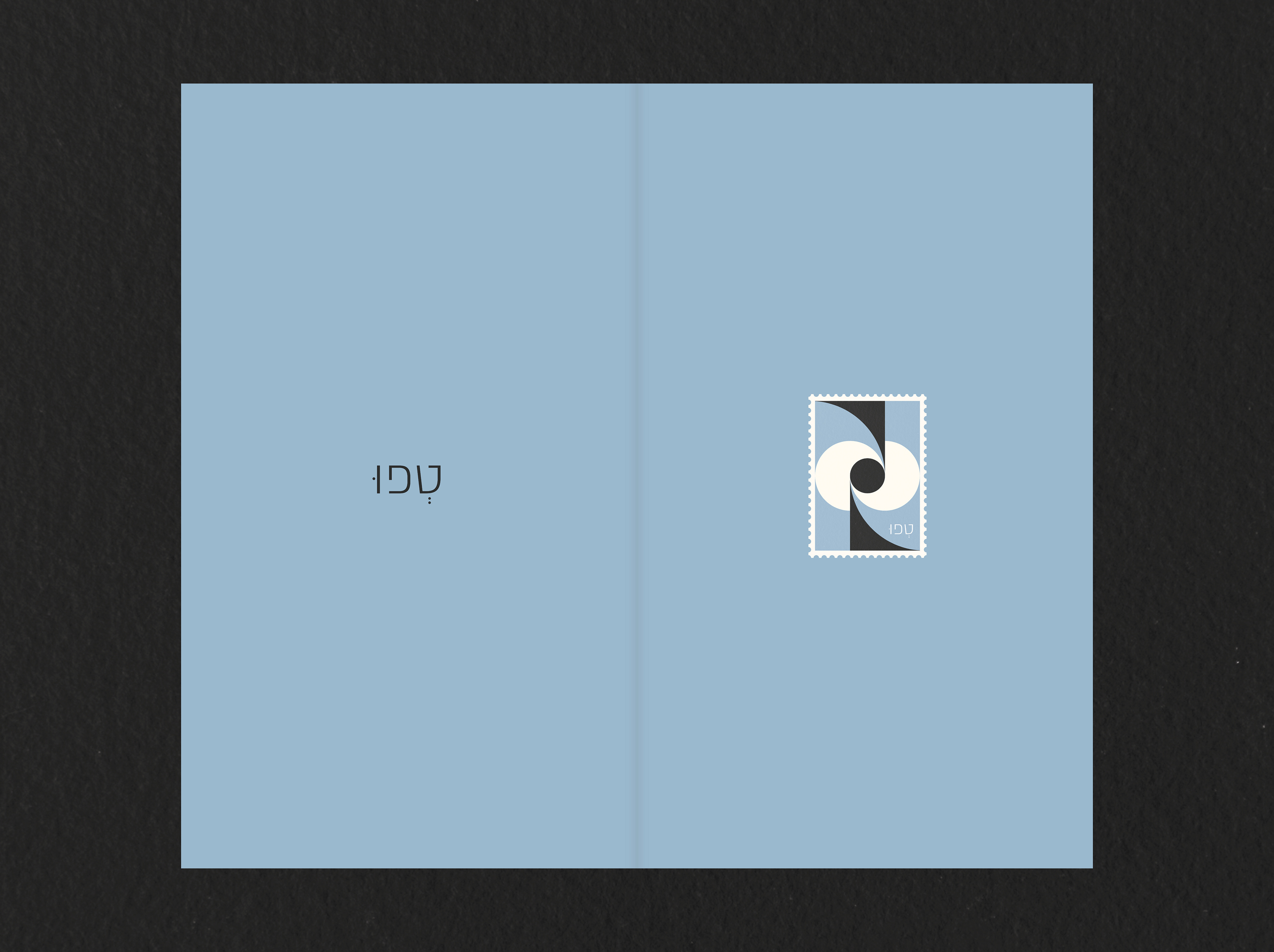
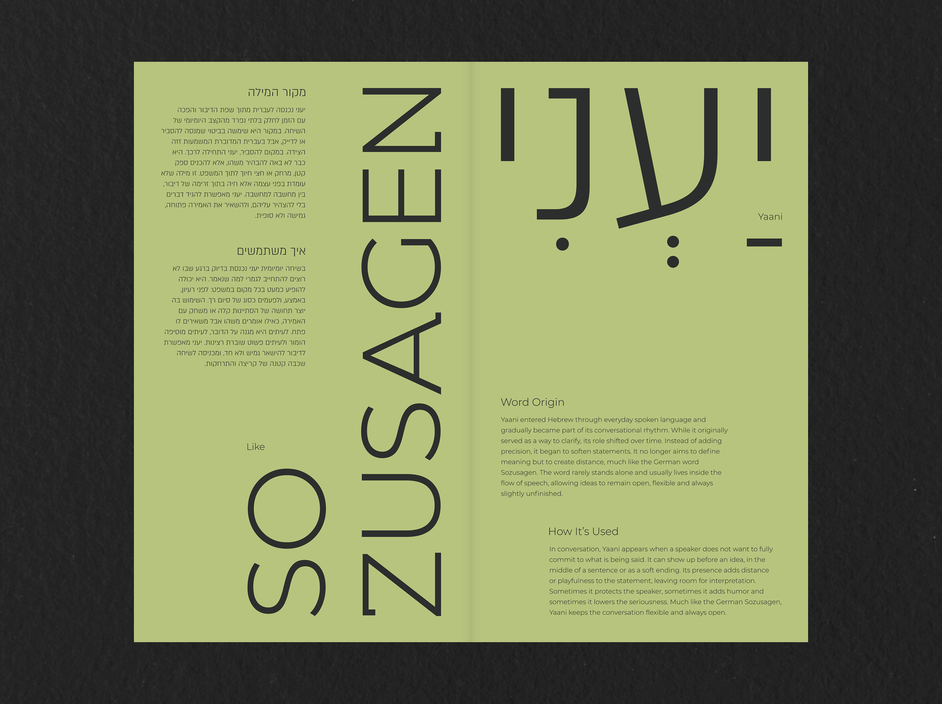
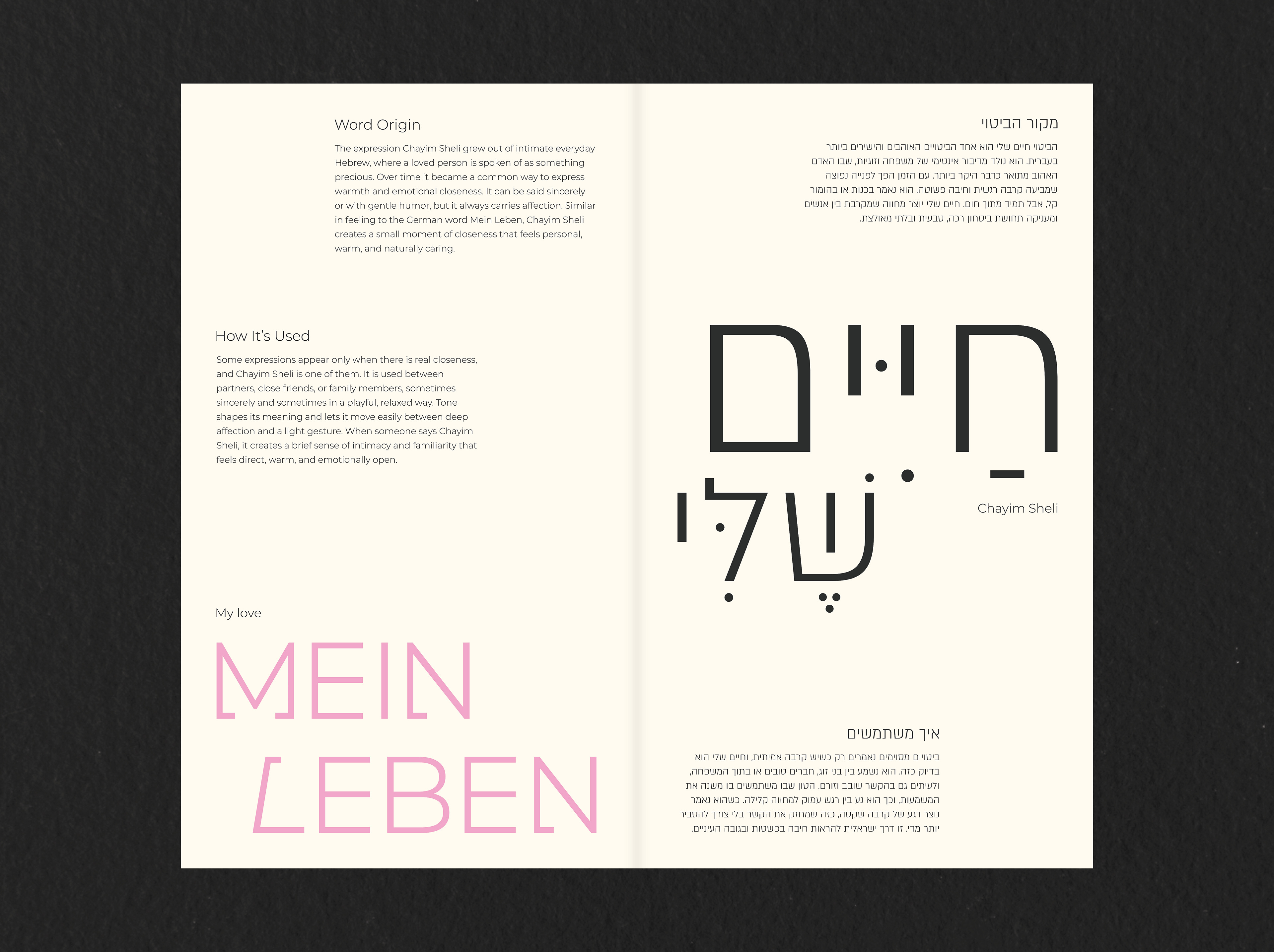
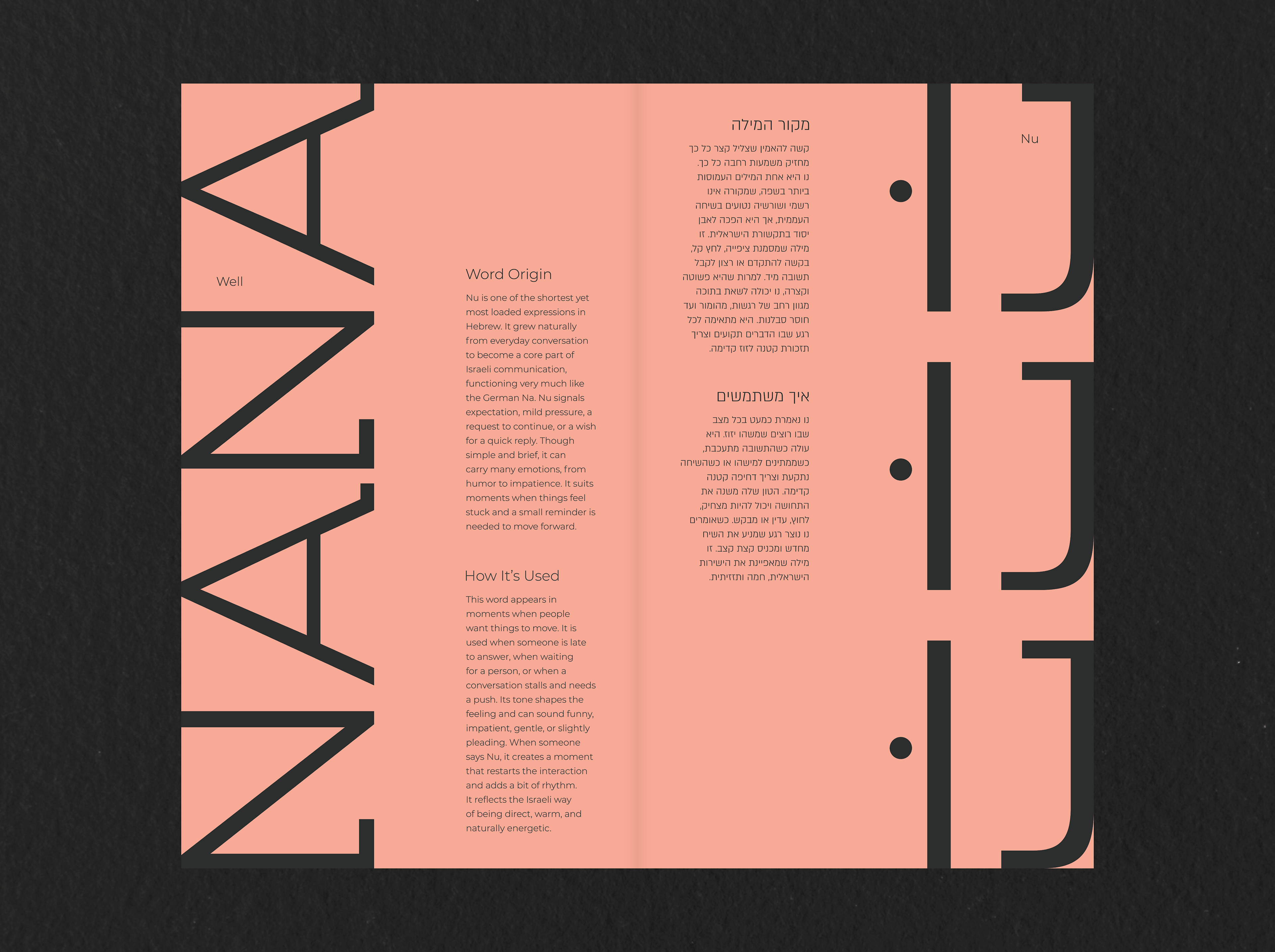
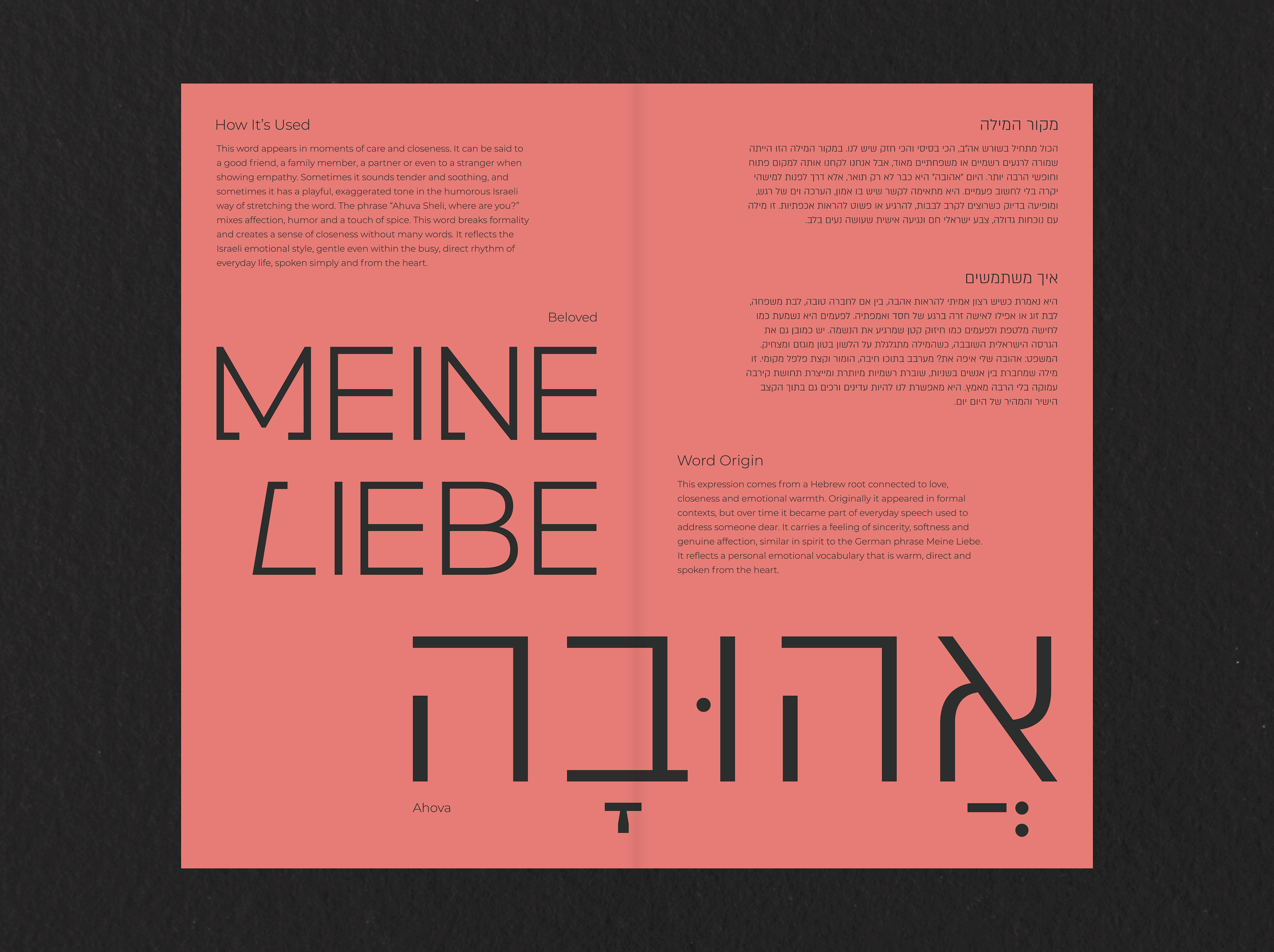
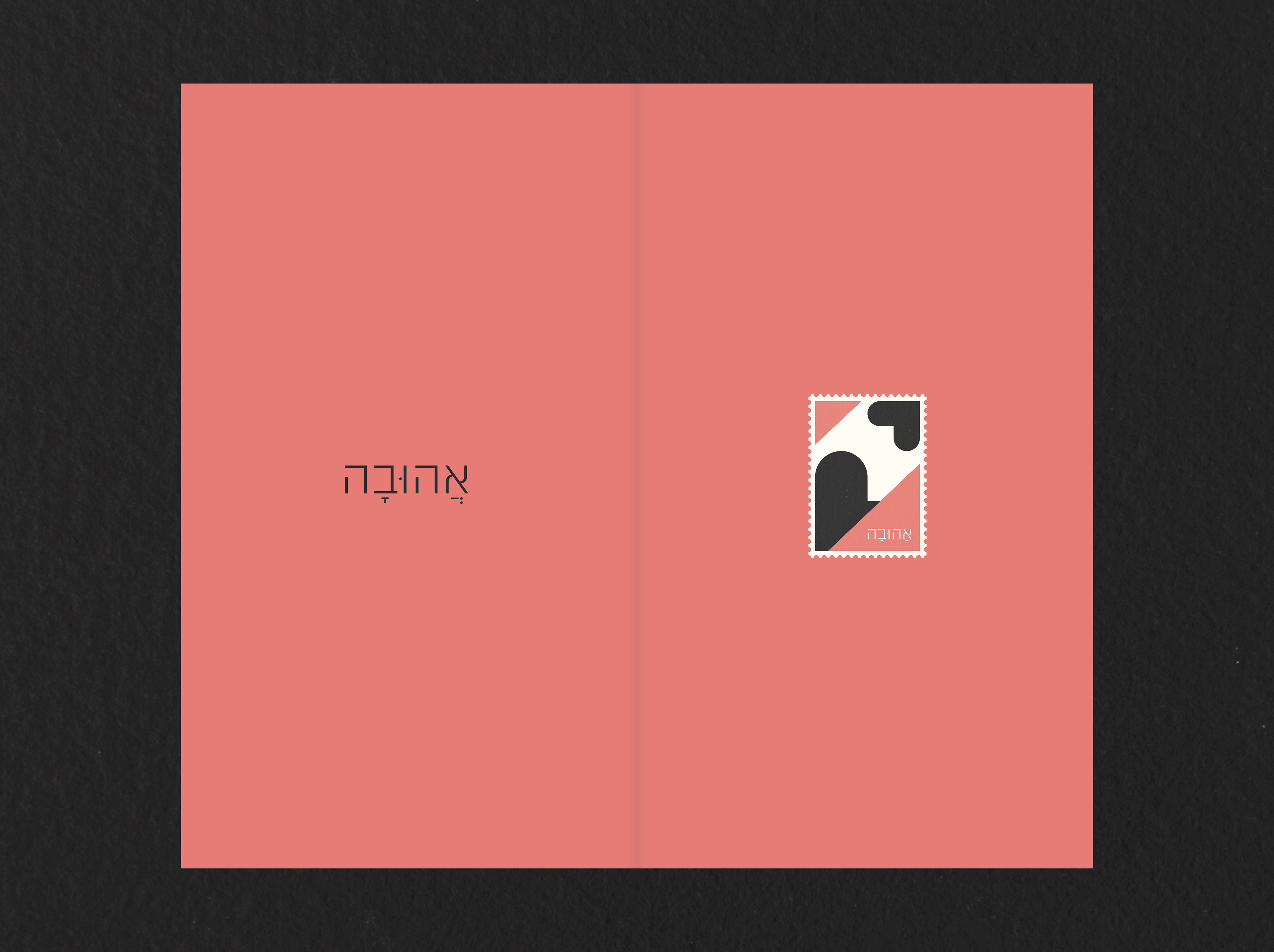
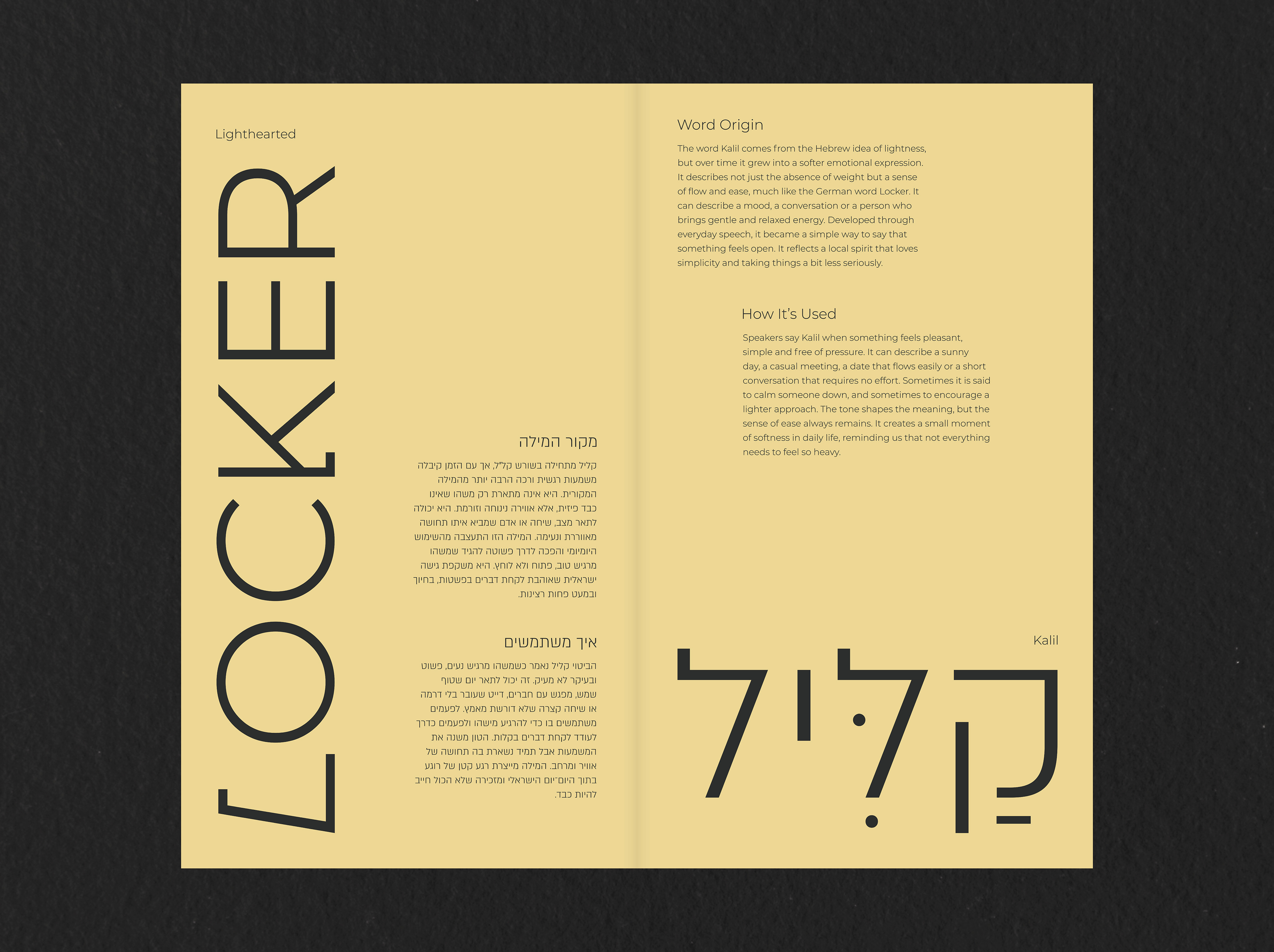
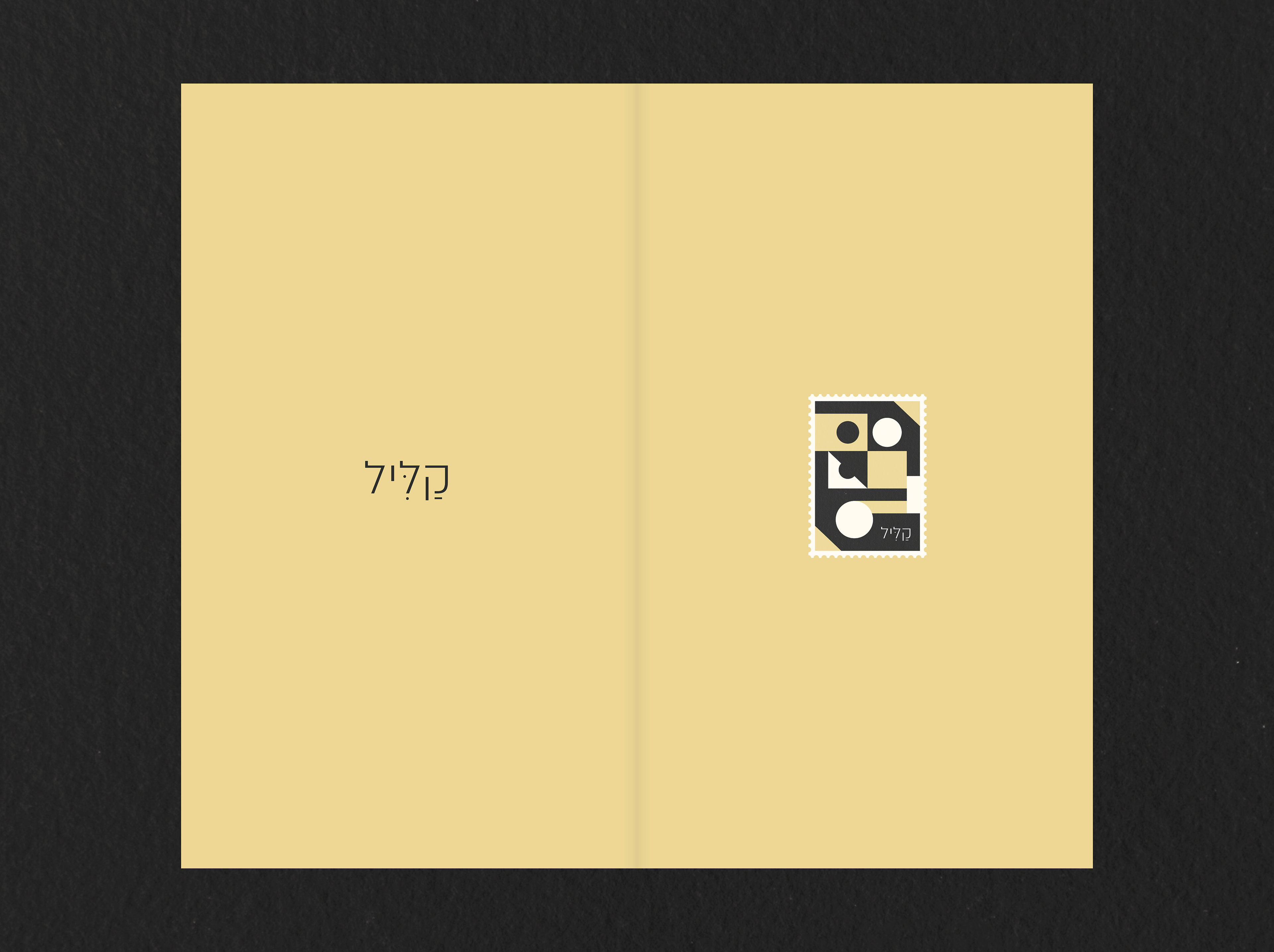
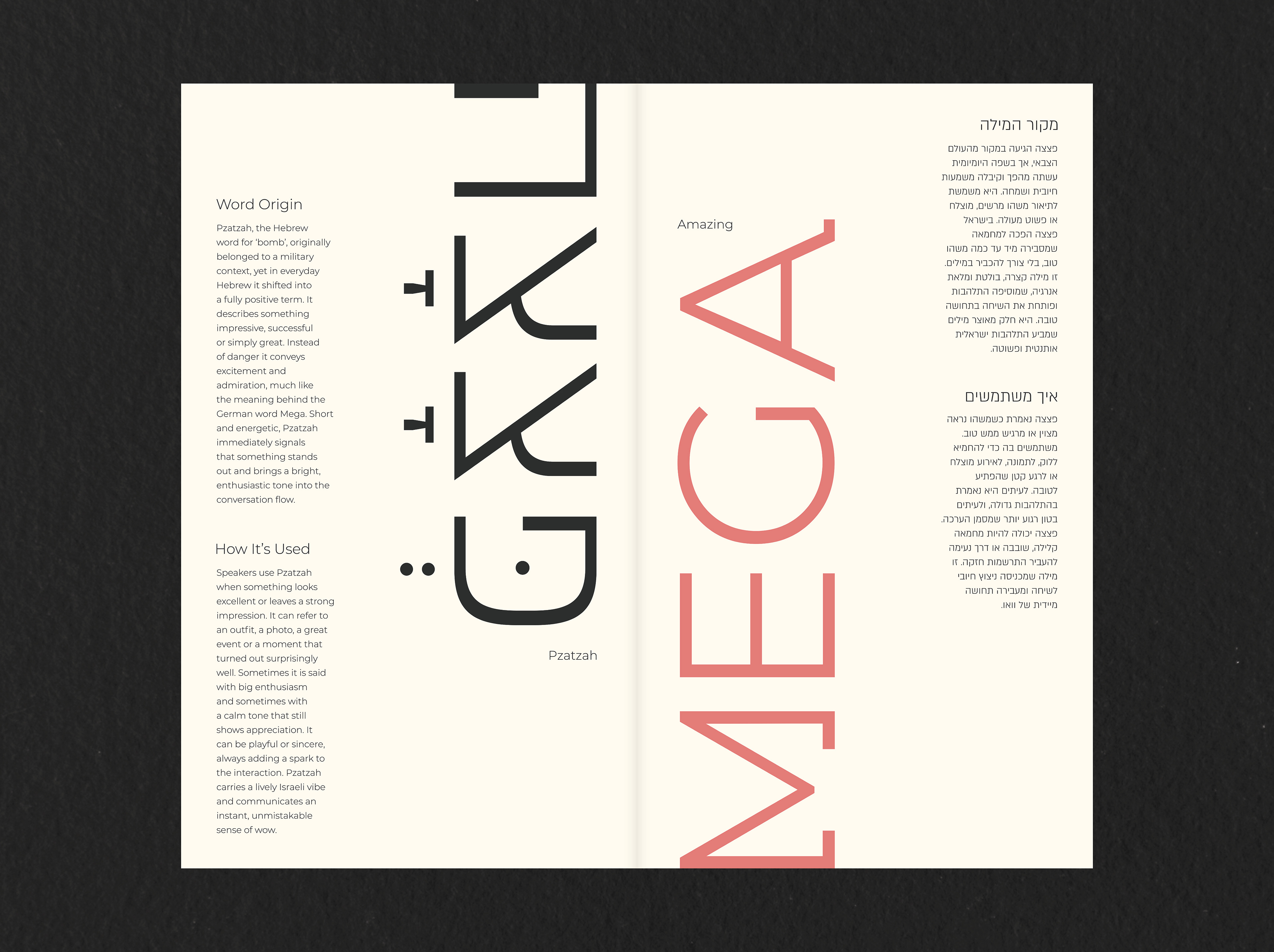
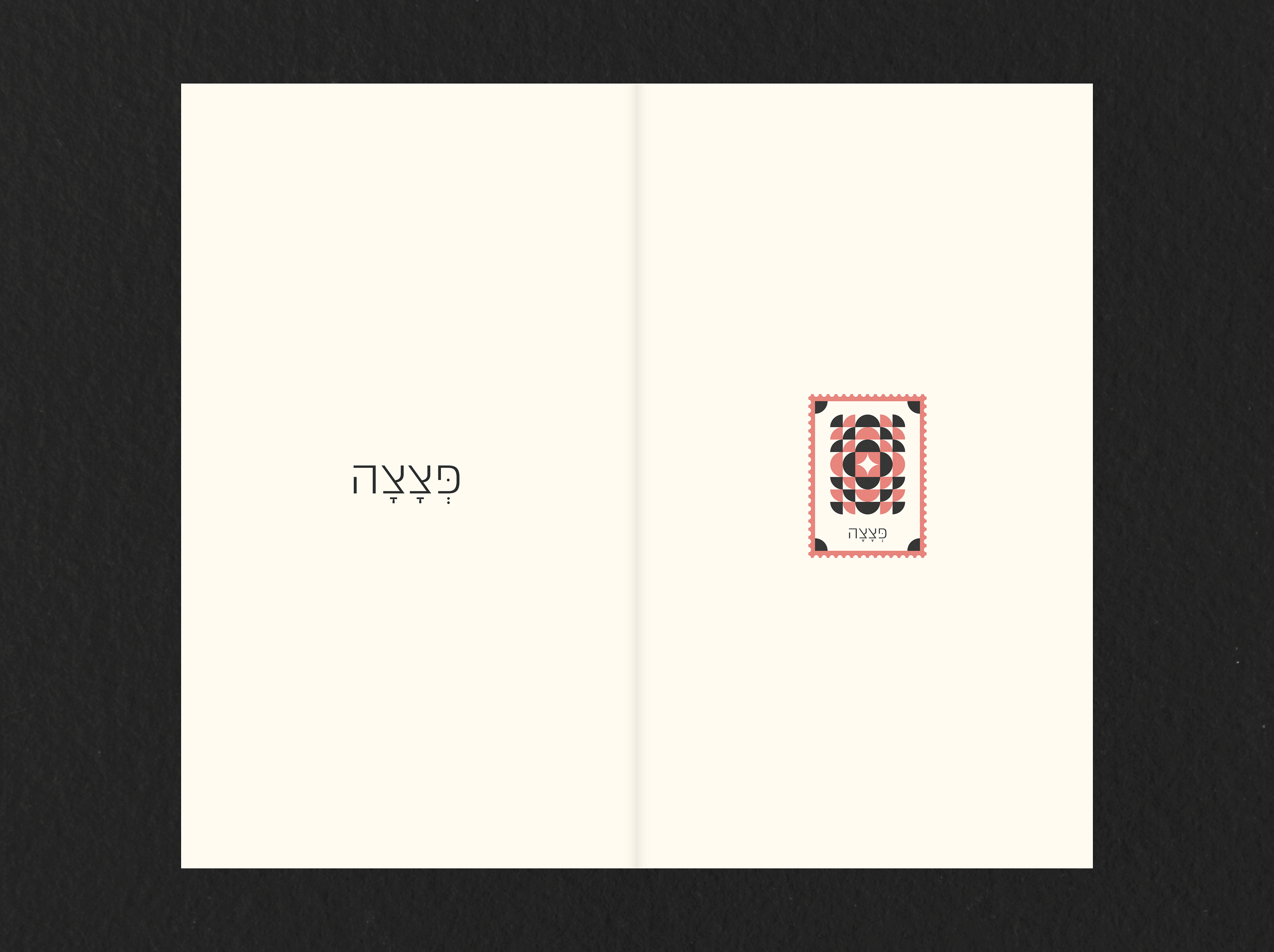
Inspired by the personal journey of relocation, the magazine explores the cultural gap that occurs when living in a foreign language. It focuses on Hebrew words with no German equivalent, giving them a visual stage that conveys their emotional weight. The content is divided into three chapters Intensity, Dynamics and Perspective grouping a collection of 30 words by their character and energy to create a dialogue that reveals what is often lost in translation. The visual language gives physical form to abstract concepts through a stamp system designed as a geometric interpretation of each word. The color palette, drawn from Israeli street aesthetics and vintage stamps, combines with a dual reading structure where languages meet in the middle. To ensure visual harmony I created a custom Latin typeface to match the Hebrew script alongside the neutral Israeli font Almoni, allowing the meaning to take center stage without distraction. Hebrew Typography : Almoni by Avraham Cornfeld | AlefAlefAlef | 2012 Editorial Design | 2026 | Brand University of Applied Sciences